Mixed Media ICAD, Using Up Some Scrappy Papers
Mixed Media ICAD, Using Scrap Papers From My Stash
Hello, everyone! I am
back with another ICAD – this time, I was determined to use up some of my
leftover bits of papers and used postage stamps. I will apologize up front, as some of the
photos aren’t very clear, but I used the ‘snapshot’ feature on some of them
using a video editing software, and the images became blurred when I made them
bigger.

Yes, you heard right! I made my very first YouTube video! Whoot, whoot! I’m doing the jiggy dance as I type this –
soooo…I still have areas that I need to improve on, but hey, you never learn if
you never ‘do’, right? If you are
interested in the video, you can find it here or find it at the bottom of my post.
That being said, I don’t think I will use photos from the video
anymore. They just get too fuzzy when I enlarge
the images. Lesson learned for next
time!
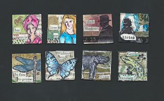
As I mentioned above, I have too many leftover bits of
papers that I used in other projects….bookpages, scrapbook/patterned papers,
security envelopes, used postage stamps, unused images/stamped images….I really
need to use these things or toss them, so I decided to pull out my book of
index cards. I glued the bits here and
there. I used up some torn bookpages, a
couple of patterned papers (one of which had a butterfly shape punched out of
it…I ended up covering it up, so you can’t see it now), and some random bits of
punched shapes and cancelled postage stamps.
Everything was glued down and sealed with Mod Podge.

Once it was dry, I took my Art Basics Heavy Gesso and
scraped it all over the project with a cheapy palette knife. I didn’t want to
completely cover the papers, but I did want them pushed to the background and
make the random bits and bobs more cohesive.

Once the gesso was dry, I used the Tim Holtz mini-stencil
called “Mini Blossom” and some Liquitex light modeling paste, and added the
flowers to the left side of the index card. I dried it with my heat gun, but I either didn’t
dry it well enough or I got too close with the heat tool, because I discovered
later that the modeling paste wasn’t completely dry in some areas.

I pulled out three paints: Decoart Fluid Acrylics in Payne’s Grey and
Colbalt Teal, and the Dina Wakley Acrylic in “Night”. (Oh my gosh, this is one
of my favorite shades of blue!! It’s such
a gorgeous shade of sapphire!) I
spritzed the heck out of the card and first dabbed the Payne’s Grey along the
bottom edge – a little more spritzing with the water had it running nicely into
the nooks and crannies. I did the same
with the much lighter Cobalt Teal – I just used a bit to help add some visual
interest, but it was the Dina Wakley “Night” that really popped. For this one, I dabbed a tiny bit on my glass
mat and added enough water to make it the consistency or an ink or watery
watercolor. Then I added it to the page
with more spritzing of the water and wow – it’s such a gorgeous color!

As I dried the paint, I decided that I would use a blue
heron image that I downloaded from The Graphic’s Fairy (link here). I had originally intended to use it in a
different project, but never did…which worked out well, because he fits so
perfectly here! I did end up lightening the area I was going
to place him by rubbing on a bit of Liquitex white gesso because I thought the
heron blended into the blue background a little too much. I also pulled out my Inktense blocks and
added some shading here and there – there was a punched flower shape behind the
heron that I wanted to highlight, as well as some of the other shapes.
I finished by tearing some scraps of patterned paper, added a strip from a
Tim Holtz tissue tape, and viola – it’s perfect!
I hope you liked today’s project! Until next time, have a great week!


ReplyDeleteThe primary skin inflammation healthy skin tip that I am going to impart to you it is that you should in every case clean your skin tenderly. Remember cleanliness is of most extreme significance when battling. http://firmativabout.com