Stamping Into Acrylics - Sponge-Tree Canvas
If you would like to learn how to paint, I highly recommend taking a look at Angela Anderson's channel here; for this canvas, I followed her free lesson called "Easy Acrylic Painting Tutorial - Impressionist Trees, which you can find the video here. I can barely draw most times, much less paint, but I am so thrilled with how it turned out! Seriously - if you would like to learn how to paint, Ms Anderson has a ton of beginner videos are easy to follow along!
To start with, I dropped a grey and a bit of raw umber onto the canvas, and spread it around with one of those fake credit cards you get with the junk mail. It was a bit darker than I liked, so I added a bit of Liquitex gesso to lighten it up a bit.
At this point, I had decided that the paint was too thin to stamp effectively, (this was just an assumption on my part...I had no idea if it would have turned out as well if I had stamped into the thinner paint) so while the paint was still wet, I dropped a relatively thick layer of Golden Heavy Gesso onto the canvas and spread that around as well.
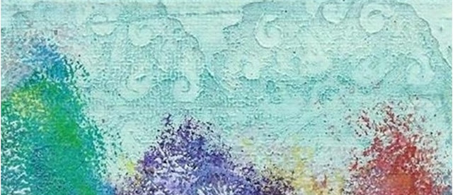
While the gesso/paint was still wet, I took a medallion stamp and pressed it firmly into the mix all along the top and bottom of the canvas. In the end, you don't see the pattern as well at the bottom of the canvas, but you can easily see the it in the sky. If the paint/gesso is really wet, the more intricate designs won't come though clearly, and will usually look like a bumpy mess. If you let it dry just a tad and use a larger type of pattern, then it usually comes through beautifully. The imprint won't be perfect, as the paint/gesso/art medium tends to stick to whatever it is that you press into it, but you are usually left with a wonderful imprint.
Once the canvas was completely dry, I made an acrylic wash by watering down some DecoArt fluid acrylic...like, a lot. I wanted the first wash to be light, as it was more of a test to see how it would turn out. Needless to say, I loved it, so I went back over it with a wash of a darker blue. Just look at that pattern....isn't it cool? I love it when something turned out better than I expected!
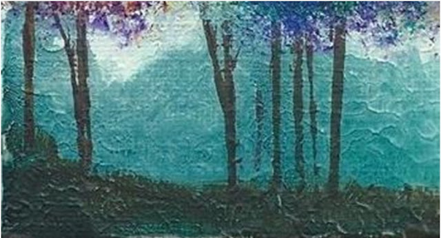
I finished the rest of the painting by following Ms Anderson's instructions, but I wasn't happy with how my ground turned out. I ended up being a little more heavy-handed with the paint, so I ended up fixing it by creating 'ground cover'....I wanted to give the appearance of underbrush. I wanted to darken what I dubbed "the underbrush" to give the appearance of shade and shadow. So I spritzed the bottom of the canvas (the ground area) with water, and carefully dropped a tiny amount of Daler-Rowney FW's black acrylic ink onto it. This ink is very liquid, so a little bit goes a long way! I let it run around, but I dabbed it back before it reached the trees. Because it was such a tiny amount of ink, you can't really see it. It helped add dimension to the painting, but I still felt it needed something more, so I pulled out my Liquitex's liquid acrylic paint in Muted Green. It's liquidy, but no where near as much as the ink. I spread drops along the bottom of the canvas, spritzed it with more water, and tilted the canvas this way and that to help it spread. Perfection!
And that's it! Thank you for stopping by - I hope you like what you see! Until next time...happy painting!


love this!
ReplyDeleteomg!! I love it!!!
ReplyDelete