Sea-Themed Artist Trading Coins
Hello again! I am back, this time to show how I made the Artist Trading Coins pictured below. The Coins continue to be all the rage amongst the mail art traders, and I personally really enjoy working on a round shape.
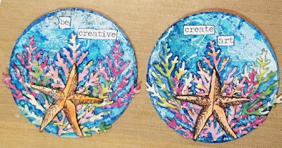
Aren't they cool? I love how they turned out! (I say that because most of the time, I don't know where I'm going when I start a project, so sometimes there's no telling how something will turn out!)
Anyhow, I started with a 5x7 sheet of Canson mixed media paper and Ranger's Tim Holtz Distress Inks in various colors of blue and the Iced Spruce color. I mushed one, two or three colors onto my craft mat, spritzed lightly with water, and dragged the paper through the wet colors. By dragging the papers, I get a nice smooth blend of colors. Because I had so much ink left over, I pulled out some blank Artist Trading Card mixed media paper to sop up the extra inks. I dried the papers between each layer, did another drag-through with a fresh mess o' spritzed ink, dried that, and began tapping the papers through different shades of blue from the base color. By tapping on the ink, I get a more spotted or marbled look to the paper.

Gorgeous, right? Now, I want to add more visual interest to the paper, so I pulled out my Stamper's Anonymous Butterfly Melange stamp set and Tim Holtz stencils and selected the Gothic (the damask) and the Latticework stencil. I stamped randomly with the text stamp, but wanted to try something new (for me) with the stenciling. I wanted to try a negative effect, so I tapped blue Distress Ink directly onto the Gothic stencil, spritzed it lightly with water (left picture), and pressed it onto a card. It was supposed to have acted like a stamp and leave the impression of the damask pattern, but what ended up happening was it left spots on my card (center picture), but no pattern. Hmm. Maybe I used too much water? I tried it on another card, but got the spots again. Well, darn! I tried it one more time on a blank piece of paper, and what do you know? It left the pattern! (Right picture.) That's what was supposed to have happened on my test card.


So pretty! On one coin, I glued everything down with soft gel medium, but that was very messy, and you could see the gel in areas where I didn't want gel. So for the second coin, I used a glue stick. It was less messy, but I did have to go back and apply the soft gel medium with a toothpick.
As a final touch, I used a Jane Davenport "mermaid marker" to add some shading around the seaweed/coral. You can see the difference (hopefully) between the coins on the left (shaded) and the right (not shaded.) And, of course, I finished by adding quotes using the Tim Holtz ChitChat stickers.


I hope you like them! Thank you so much for stopping by!

Aren't they cool? I love how they turned out! (I say that because most of the time, I don't know where I'm going when I start a project, so sometimes there's no telling how something will turn out!)
Anyhow, I started with a 5x7 sheet of Canson mixed media paper and Ranger's Tim Holtz Distress Inks in various colors of blue and the Iced Spruce color. I mushed one, two or three colors onto my craft mat, spritzed lightly with water, and dragged the paper through the wet colors. By dragging the papers, I get a nice smooth blend of colors. Because I had so much ink left over, I pulled out some blank Artist Trading Card mixed media paper to sop up the extra inks. I dried the papers between each layer, did another drag-through with a fresh mess o' spritzed ink, dried that, and began tapping the papers through different shades of blue from the base color. By tapping on the ink, I get a more spotted or marbled look to the paper.

Gorgeous, right? Now, I want to add more visual interest to the paper, so I pulled out my Stamper's Anonymous Butterfly Melange stamp set and Tim Holtz stencils and selected the Gothic (the damask) and the Latticework stencil. I stamped randomly with the text stamp, but wanted to try something new (for me) with the stenciling. I wanted to try a negative effect, so I tapped blue Distress Ink directly onto the Gothic stencil, spritzed it lightly with water (left picture), and pressed it onto a card. It was supposed to have acted like a stamp and leave the impression of the damask pattern, but what ended up happening was it left spots on my card (center picture), but no pattern. Hmm. Maybe I used too much water? I tried it on another card, but got the spots again. Well, darn! I tried it one more time on a blank piece of paper, and what do you know? It left the pattern! (Right picture.) That's what was supposed to have happened on my test card.

A little frustrated, I decided to use the Gothic stencil in the more traditional way with a dark blue ink. I just couldn't leave the technique alone though, so I pulled out the Latticework stencil and tried it again. I tapped the ink onto the stencil, spritzed with water, and......IT WORKED! It's hard to tell from the picture below, but it did leave the circle design on the card.

Good, now I can move on. With all this blue, I needed some white. So I pulled out my favorite Finnabair stamp from the Old Town collection. Because I used Distress Ink, which reacts to water, I decided to spread a thin layer of gesso onto my craft mat. The gesso should be thick enough that it won't absorb the Distress Ink. I tapped the stamp onto the gesso a couple of times and stamped the papers. After every few stamps, I would go an wash the gesso off with water and a toothbrush (to get into all the little nook and crannies). It's not a big deal if you don't clean ink off your stamps (unless it's a water reactive ink), but acrylic paints and gesso will ruin a stamp if you let it dry. The effect was perfect!

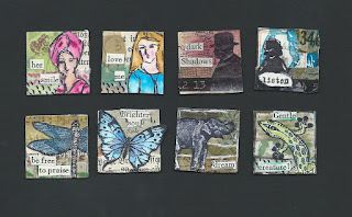
Now that I'm happy with the background papers, it's time to move onto the focal images. I used two different oranges and a coral colored Distress Ink to make the color for the starfish. I stamped extras, because I also want to make a couple of sea-themed artist trading cards.

To make the seaweed/coral, I decided to move away from Distress Inks and use washi tapes instead. For this, I pulled out washi tapes in greens and pinks. I layered three rows of washi tape onto mixed media cardstock and punched them out using the Sizzix Tim Holtz Juniper punch. I turned the washi paper around so that the seaweed/coral fronds would curve to the left or the right. I wanted them to follow the contour of the circle.

As a final touch, I used a Jane Davenport "mermaid marker" to add some shading around the seaweed/coral. You can see the difference (hopefully) between the coins on the left (shaded) and the right (not shaded.) And, of course, I finished by adding quotes using the Tim Holtz ChitChat stickers.

I hope you like them! Thank you so much for stopping by!


Comments
Post a Comment